Sports teams’ logos are as much of an identity of the team as the city they reside in or the players who dawn the jerseys. Logos are so iconic that even non-sports fans are able to identify what team they belong to.
The Cincinnati Bengals' logos have never been that, but one could argue it’s probably because they’ve spent much of their existence in a kind of obscurity. Maybe now that Joe Burrow has helped make them relevant again, people could recognize the tiger-striped B.
Paul Brown began to plan the creation of our Bengals in 1965. In 1967 it was official and they became a part of the American Football League (AFL), their first season in the AFL was in 1968. Their logo was a far cry from the minimalist take that they have now.
Their first logo, which only stayed until the AFL/NFL merger in 1970, was completely different than all the other iterations that followed. The original Bengals logo was a Hobbes-esque Bengal tiger running with a football as his helmet has flown off.
As he is running he is looking with the same look my dog gets when she eats something she shouldn’t and is running from me. It was one of the more intricate football team logos in either league.
The team only used this primary logo for their first two seasons in 1968 through the 1969 season. In 1970 they adopted a new logo which began the path to the current logo and is much more in line with every other primary logo to come.
In 1970, when the AFL and NFL officially became the NFL with two conferences. It’s as if the Bengals felt like they needed a more professional primary logo. Kind of like when you leave college you have to get a professional/grown-up email.
The logo was a spitting image of their helmet at the time. Just a picture of the orange helmet with the Bengals in all caps on the side of the helmet. No stripes on the helmet yet, those would come later. This logo would become synonymous with the Ken Anderson years.
This logo lasted for 11 seasons all the way through the 1980 season. Either the rebrand was a smart decision or it was just luck, but the second they moved on from this logo they made their first Super Bowl. So, as cool as it would be for them to bust these out one season, maybe it would be a curse.
Bengals logo history
In 1981 they dawned the now famous black and orange tiger-striped helmets and a new primary logo to match. According to Bengals.com, Paul Brown said:
"Paul Brown, the team's founder who then held the title of Vice President and General Manager, said the team wanted a helmet that would be instantly identifiable with the Cincinnati franchise, something akin to the Baltimore Colts horseshoe helmet and the San Diego Chargers lightning bolt helmet."Bengals.com
Paul Brown’s idea worked. Those stripes have become the main identifying trait of our beloved team. The face guard still had the two bars, but they made the face mask black. This logo stayed for nine seasons before being changed again in 1990.
For the 1990 season the Bengals made a new primary logo. Similar to their previous one. However, this one had the new modern face mask, still black, with a new tiger stripe pattern. This logo would primarily be associated, unfortunately, with the “Bungles”.
This logo only lasted seven seasons. Then Cincinnati finally decided to create a true logo, not just a helmet as a logo. The logo was a Black and Orange Bengal Tiger with a menacing look on its face. This logo also lasted seven seasons, from 1997 to 2003.
The last year of this logo coincided with the hire of Marvin Lewis and Carson Palmer’s rookie season. Despite this one-season crossover, the Bengal head will forever be synonymous with the Marvin Lewis/Carson Palmer era.
With a new regime and better years ahead, Cincinnati wanted to create a new primary logo. This new logo has had the longest life, coming into existence in 2004 and staying until the present day. There doesn’t seem to be a reason to change this logo again.
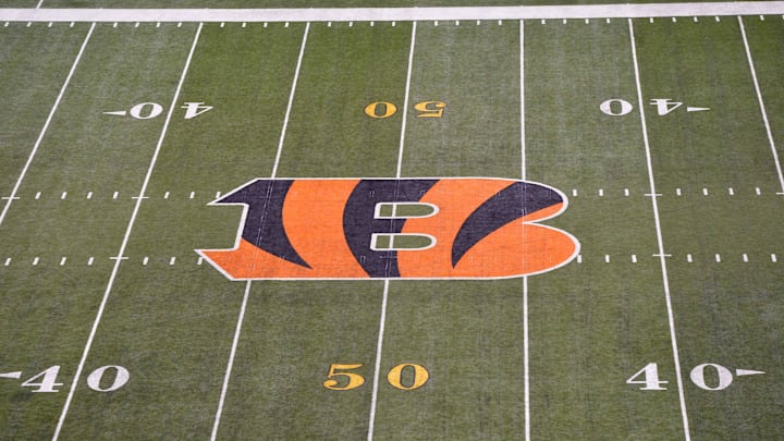
It’s a simplistic design, a capital B, orange with black tiger stripes. It is a modern design, simple and clean. At the same time, it is a timeless logo, like the Packers G or the Bears C. Instantly recognizable, which is why we won’t see a new primary logo design for a long time, if ever.
Well in fact they did technically change it in 2021. They made the orange on the B a shade darker to match the orange of their uniforms. It was a minor change and they announced the change with little fanfare because most people couldn't notice anyways.
You can checkout all of the primary logo iterations at the link below.
What do you think? Should the Bengals change their logo? Should they bring back the running Bengal?
